A lot of the casinos I worked with did monthly promotions, games where the players could trade in points for a monthly drawing of a big prize.
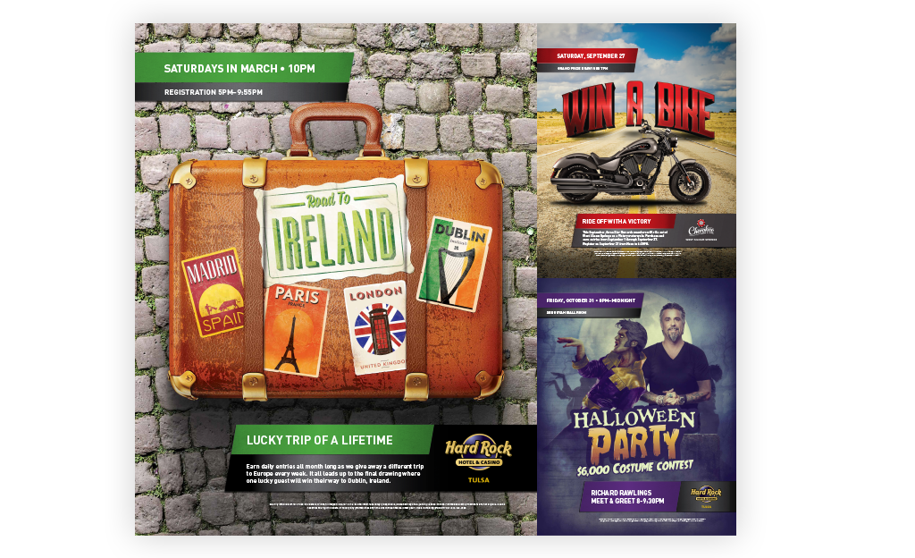
When I started working with the Cherokee Nation, each of their eight casinos was creating their own ads. There was no consistency in looks, colors, information layout. It was chaos. A year into the account, we created the first unified promotional look for them.
The first look is called the bricks. There are clearly defined areas for everything. The upper portion is for the promo logo and prize, which is custom designed for each promo. The lower section is the four bricks, each with a specific purpose. The top left brick contains the headline and general promo details. The lower left brick is the entry dates, and the lower right is the drawing date. These bricks are color coordinated to the promo logo. The far right large brick is either black or gray and holds the property or venue logo.
Two years later, the look was refreshed. Two of the bricks were moved to the top left to highlight the drawing date and entry times. Everything else stayed at the bottom, but are now anchored to the left hand side.
Both of these looks were used across the entire campaigns. Posters, outdoor, online ads, emails, TV spots, plasma screens on the casino floor, small ads displayed on the machines on the floor. Cherokee Nation Entertainment loved them because it made it easier to spot their ads in the wild. They simplified the process of building out the campaign materials, speeding up the entire process.
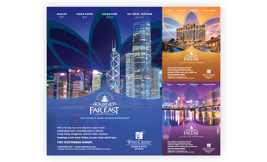
Wind Creek was different. They had three casinos and ran company-wide quarterly campaigns. My team built the initial looks for those big campaigns and handed them over to the internal team to build them out. They were still kept simple to make it easy on the team that had to build the supplemental pieces.